19.04.2016
3 min read
By John Skinner in Design & build
The twilight zone
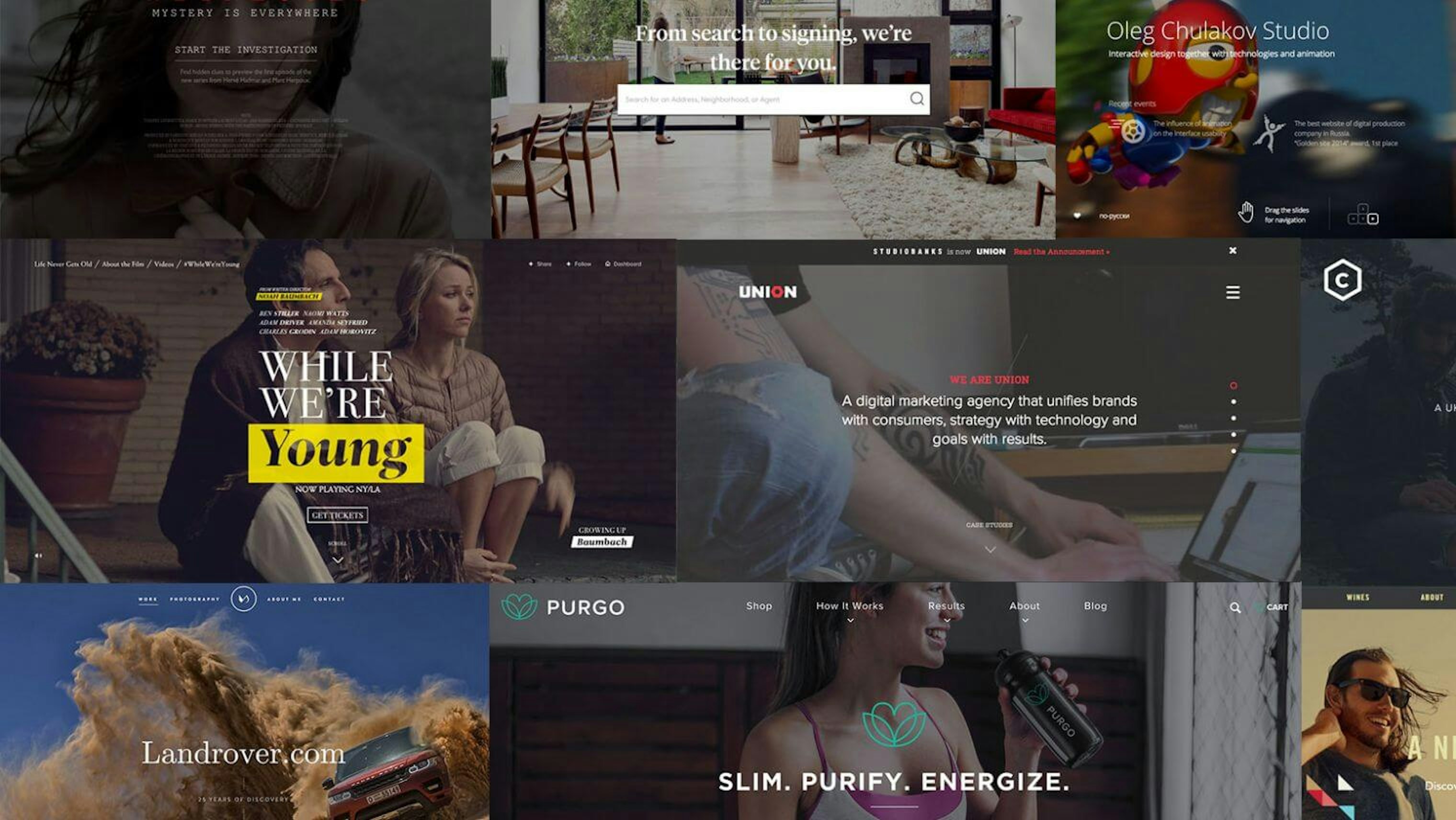
We have all seen design trends come and go over time. From animated flash-based splash pages, the web 2.0 ‘look’, or a seemingly ubiquitous typeface – it is evident that the look and feel of web design has always been influenced by current stylistic moires. For instance, I have been struck recently by how many sites have used the technique of using a slightly darkened header image behind a reversed out headline/lead copy. It has become a bit of a design shorthand in web design, both a trend and a facile solution to the problem of combining image and type.
Whilst in some cases effective, I do wonder if we will look back in a few years time and wonder why some many websites looked like they existed in a perpetual dusk.
I am sure that as designers we are more susceptible to this than we would like to admit. We like to try new features in design software; we are impressed by a clever implementation of browser technology; by successful brands, and effective advertising campaigns. Despite our individual tastes (and our best efforts to protect our individuality) we are all subject to similar sources of visual influence.
To some degree the subliminal power of what we see and experience is probably impossible to escape. I remember watching a TV programme presented by Derren Brown where he confidently predicted the routes a couple of art directors would take on a given brief by placing visuals clues along a taxi route he took them on beforehand. Whether or not you completely believe in the veracity of the programme; it is not hard to imagine there is truth in the underlying premise.
This is a good reason why we should be rapacious in our consumption of visual stimuli; to read widely, watch keenly and observe enthusiastically. The wider we cast our gaze, the less susceptible we become overly influenced by a narrow set of stimuli.
To some degree the subliminal power of what we see and experience is probably impossible to escape.
However, some would also argue that, particularly in web design, our desire to be novel must be tempered with an appreciation of established usability conventions. Quirky navigational devices tend to frustrate rather than impress. Familiarity speeds intent [sorry] when it comes to online communication.
The eminent Michael Beirut recently wrote that as designers we might be guilty of chasing ‘pre-emptive creativity’ rather than the primary aim of cogent communication:
“When my team was working on a new logo for a major telecommunications company last year, I felt we had arrived at a solution that solved every problem but one: it didn’t demonstrate how creative we were. After many attempts, I came to feel that all these gestures were self-indulgent and, in fact, interfered with the communication of clarity and simplicity. We went with the simple solution and took the consequences.”
Beirut’s contention is that in looking to ‘creativity’ as a solution rather than a device we can end up in a communication straightjacket rather than a flexible, scaleable tool. We must look beyond ourselves and see our role as a facilitator as much as a creator.
However, it is inarguable that we should always remain alert to the possibility of pushing the boundaries and finding better ways of doing things. Designers relish the opportunity to work on the edges of a brief or the available technology, and yet it can be all too easy to lapse into the safety and comfort of an established pattern.
I was recently entering a password into a large screen smart TV. The keyboard on the screen is visible to everyone in the room and so it is clear which characters are being input into the form. And yet the characters were hidden in the form. I wonder if the overriding rationale to doing this would was that ‘passwords are always blanked out’. It’s a familiar pattern, but doesn’t make a lot of sense in this scenario. Patterns and rules are there to be challenged and we should work from the user up rather than going straight to an established ‘shortcut’.
I wonder too if the speed at which we can work these days affects our ability to take enough time to actually make real decisions. Does selecting from a dropdown menu kick-off the same thought processes as reaching for the Letraset or ordering type from the setter?
Clearly, it is our job as designers to try to work within the strict confines of the brief to ensure that our solutions are based in the objective needs of the client. Our starting point must always be the question ‘what is the most appropriate way of communicating what the client is trying to achieve’? It must be more than decorative gloss; it must form a language that is readily consumed and understood by the intended audience to facilitate, for example, a purchase or a sign-up.
In order to achieve this aim we must challenge, coerce, think radically, to work on the details and make decisions rather than fall into patterns. However, we also must be prepared to step aside and accept that the only absolute prerequisite is the clarity of the communication.